Lessons learnt from data visualization course
At Open Development Myanmar, one of our main goals is to help people understand the facts behind the data by showing it in a visual context, which means data visualization is a very important part of our work. In June 2018, the Knight Center for Journalism launched an online course in data visualization that taught us very useful techniques for creating appealing, effective visualizations and infographics. Taught by Alberto Cairo, who is a prominent professor of data journalism, the course was geared for anyone who wanted to include data visualizations in their everyday work. In this blog, we will share two things that we learned in the course.
1. 3 elements of visualization
All infographics and visualizations that explain a data set need to be considered in three separate components : (1) framework (2) one or more visual encodings and (3) annotations. This means that ideally, a visual context will be perfect if there is a container, content showing exact meanings of data, and appropriate annotation. But what do all these terms mean?
First, the framework includes scales to correctly measure the chart within its boundary. Second, we need to add actual content of the chart which is known as visual encoding. Lastly, the annotation is for showing notes that highlight important points in the contents of the chart. And then they will together form the complete chart.
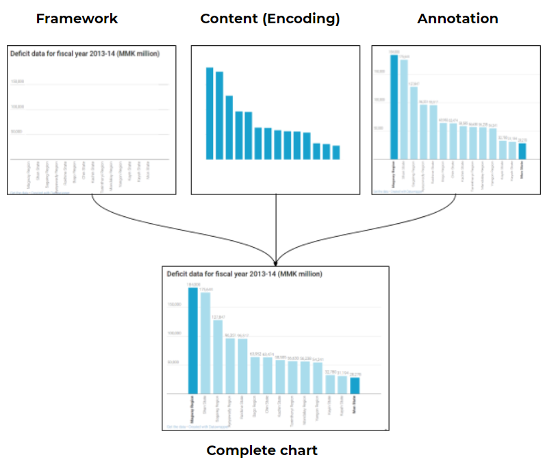
Figure 1. Example of elements of visualization using bar chart
( Source : budget.omi.org )
The above figure shows the bar chart of deficit data in Myanmar for 2013-14 fiscal year. We have broken down the complete chart into each of the three elements: framework, content and annotation. In annotation box, we highlight the fact that the deficit for Magway region is the highest (184,000 million kyats) and is the lowest in Mon state ( 28,278 million kyats).
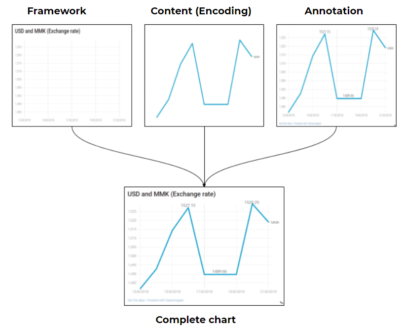
Figure 2. Example of elements of visualization using line chart
( Source : mataf.net )
The figure 2 shows the traditional line chart which contains exchange rates of US dollars to Myanmar kyats (for mid August). The annotations highlight that fact that the exchange rate of US dollar increased to 1527 kyats/USD on 16 August, and dropped to 1490 kyats/USD on 17th, before rapidly rising again to 1529 kyats/USD on 20th.
2. The importance of encoding
Encoding is one of the three components in data visualization and it is the most important one, since it is part where we actually represent the data in a visual form. It is very important to choose an appropriate encoding to show the data. Sometimes, when we get a dataset and don’t know how way we can best represent that data, whether to use a bar chart, line chart, or pie chart. It can be quite confusing because there are so many options. But don’t worry, there are techniques which can help us to decide on the most appropriate chart type!
The solution to choosing a method of encoding is ‘purpose’ . We have to always consider what we want people to see, what the graph is for, and whether we want people to compare things or to see changes over time. According to these purposes, we can decide on a type of chart or a completely different one. For example, if we want people to compare things, the bar chart is the best way to do that. Pie charts are best for comparing parts to a whole. A map is the best idea for showing data over geographic area.
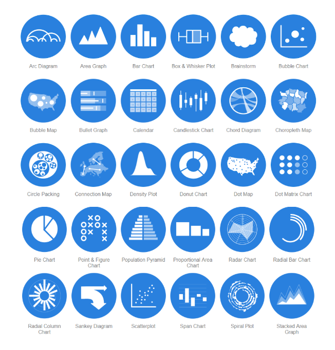
Figure 3. The Data Visualization Catalogue ( Source : datavizcatalogue.com )
There are also many freely available resources online that can help you decide which chart to use. The Data Visualization Catalogue, for example, shows the different types of encodings which can be used for specific tasks.
Here are some useful links for choosing encoding.
- Financial Times Visual Vocabulary
- Dataviz project.com
- The graphic continuum
- The Art & Science of Communicating Data
- From Data to Viz
- Ann K. Emery’s Essential Charts
- A post about 15 common types of Data Visualization from Datalabs
- Medium post about 7 Data Visualization Types You Should be Using More
So, these are the two lessons we wanted to share with you! Your visualizations will be perfect if they are based on good data and attract people’s attention. And also don’t forget to show your data in the most appropriate format by choosing the proper encoding.

